

Welcome to the final tutorial in our series — this CSS mini project tutorial brings together everything from this series into one complete, responsive, animated website.
This is Tutorial 10 of 10, the capstone of our complete CSS series on Tutorials Ocean’s CSS category. If you missed it, check out Tutorial 9: Transitions, Animations & Transforms first.
What We’re Building
In this CSS mini project tutorial, you’ll style the HTML portfolio page from our HTML series into a fully polished, responsive website using every major concept covered across this CSS series.
This project pulls together concepts from all 9 previous tutorials, so if you’ve been following along and completing each practice exercise, most of this will already feel familiar.
Setting Up the Base Styles
Every CSS mini project tutorial should start with a clean reset and sensible defaults.
* {
    margin: 0;
    padding: 0;
    box-sizing: border-box;
}

body {
    font-family: 'Poppins', sans-serif;
    line-height: 1.6;
    color: #333333;
}

img {
    max-width: 100%;
    height: auto;
}
This small block of code from Tutorial 2 and Tutorial 3 removes browser inconsistencies and sets up typography and responsive images from the start.
Styling the Header with Flexbox
header {
    display: flex;
    justify-content: space-between;
    align-items: center;
    padding: 20px 40px;
    background-color: #1a1a2e;
    color: white;
    position: sticky;
    top: 0;
    z-index: 100;
}

nav a {
    color: white;
    text-decoration: none;
    margin-left: 20px;
}
This combines Flexbox from Tutorial 6 with sticky positioning from Tutorial 5, so the header stays visible while the user scrolls.
Building the Skills Grid
.skills-grid {
    display: grid;
    grid-template-columns: repeat(auto-fit, minmax(150px, 1fr));
    gap: 20px;
    padding: 40px;
}

.skill-card {
    background-color: #f0f0f0;
    padding: 20px;
    border-radius: 12px;
    box-shadow: 0px 4px 10px rgba(0, 0, 0, 0.1);
    text-align: center;
    transition: transform 0.3s ease;
}

.skill-card:hover {
    transform: scale(1.05);
}
This section combines CSS Grid from Tutorial 7 with shadows from Tutorial 4 and a hover transition from Tutorial 9, all working together in one component.
Making It Responsive
@media (max-width: 768px) {
    header {
        flex-direction: column;
        text-align: center;
    }

    nav a {
        margin: 5px 10px;
    }

    .skills-grid {
        padding: 20px;
    }
}
These media queries from Tutorial 8 stack the header vertically and reduce padding on smaller screens, keeping everything usable on mobile devices.
For a full official reference on structuring responsive layouts, check the MDN Learn CSS guide.
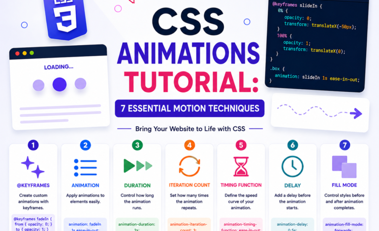
Adding an Entrance Animation
@keyframes fadeInUp {
    from {
        opacity: 0;
        transform: translateY(20px);
    }
    to {
        opacity: 1;
        transform: translateY(0);
    }
}

.hero h1 {
    animation: fadeInUp 0.8s ease-out;
}
This small keyframe animation from Tutorial 9 makes your hero heading fade and slide into place when the page first loads, adding a polished, professional feel.
Why This Structure Works
Notice how every piece of this CSS mini project tutorial uses a technique from earlier in the series — the box model controls spacing, Flexbox handles the header, Grid handles the skills section, media queries handle responsiveness, and transitions add the final polish.
This layered approach is exactly how real CSS is written on professional websites — no single property does everything alone.
Final Project Challenge
Now style your own complete portfolio page using everything from this CSS mini project tutorial series.
Requirements:
- Apply a CSS reset and set up base typography using a Google Font
- Build a sticky header using Flexbox with space-between alignment
- Create a responsive skills grid using CSS Grid with auto-fit and minmax
- Add box-shadow and border-radius to your cards, with a scale transform on hover
- Add at least two media queries to adapt your layout for tablet and mobile
- Add one @keyframes animation somewhere on the page, such as a fade-in hero section
Bonus challenge: Style your contact form from the HTML series with proper spacing, a styled submit button with a hover transition, and focus states using the :focus selector.
Once complete, you’ll have a fully styled, responsive, animated portfolio website — built entirely with hand-written CSS, no frameworks, no shortcuts.
Series Complete!
Congratulations on completing all 10 tutorials in this CSS mini project tutorial series. You now know syntax, selectors, the box model, typography, backgrounds, display and position, Flexbox, Grid, responsive design, and animations — the complete foundation every front-end developer needs.
Explore the rest of our tutorials in the CSS category anytime you need a refresher, and keep an eye on Tutorials Ocean for the next series in this learning path.
This CSS mini project tutorial is part of the complete CSS series on Tutorials Ocean — practical, beginner-friendly web development tutorials. Follow along and build real projects as you learn.