

Welcome to this CSS Grid tutorial. While Flexbox handles one dimension at a time, CSS Grid is built for two-dimensional layouts — rows and columns together — making it perfect for full page layouts.
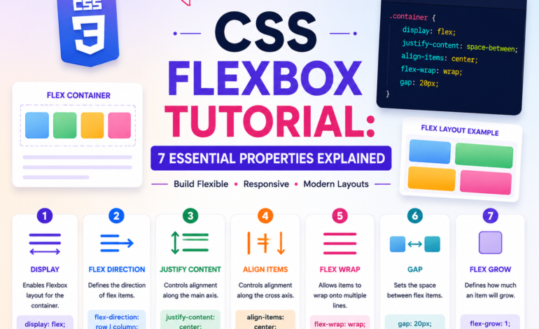
This is Tutorial 7 of 10 in our complete CSS series on Tutorials Ocean’s CSS category. If you missed it, check out Tutorial 6: CSS Flexbox first.
What is CSS Grid?
Every CSS Grid tutorial starts with the same core idea: Grid lets you define a layout as rows and columns, then place items precisely inside that structure.
Where Flexbox is great for aligning items in a single line, Grid is better suited for entire page layouts — headers, sidebars, main content, and footers all at once.
Creating a Grid Container
.container {
    display: grid;
    grid-template-columns: 200px 200px 200px;
    grid-template-rows: 100px 100px;
}
That’s the starting point of any CSS Grid tutorial. display: grid turns the container into a grid, and grid-template-columns/rows define how many tracks there are and how big each one is.
The fr Unit
.container {
    display: grid;
    grid-template-columns: 1fr 1fr 1fr;
}

.container-uneven {
    display: grid;
    grid-template-columns: 2fr 1fr 1fr;
}
fr stands for “fraction” — it distributes available space proportionally. In the second example, the first column takes up twice as much space as the other two. This is one of the most useful units covered in any CSS Grid tutorial.
The repeat() Function
.container {
    display: grid;
    grid-template-columns: repeat(3, 1fr);
}

/* Same as: grid-template-columns: 1fr 1fr 1fr; */
repeat() saves you from writing the same value multiple times, especially useful for grids with many equal columns.
The gap Property
.container {
    display: grid;
    grid-template-columns: repeat(3, 1fr);
    gap: 20px;
}
Just like in Flexbox, gap adds spacing between grid items cleanly, without needing margins on individual elements.
Responsive Grids with minmax() and auto-fit
.container {
    display: grid;
    grid-template-columns: repeat(auto-fit, minmax(200px, 1fr));
    gap: 20px;
}
This single line is one of the most powerful patterns in any modern CSS Grid tutorial. It creates as many columns as fit, each at least 200px wide, and they automatically stretch to fill remaining space — a fully responsive grid with zero media queries.
For the full official reference, check the MDN documentation on CSS Grid.
Placing Items with grid-column and grid-row
.featured-item {
    grid-column: 1 / 3;
    grid-row: 1 / 2;
}
This tells an item to span from grid line 1 to grid line 3 horizontally — covering two columns. The same logic applies to grid-row for vertical spanning.
Naming Areas with grid-template-areas
.container {
    display: grid;
    grid-template-columns: 200px 1fr;
    grid-template-areas:
        "sidebar header"
        "sidebar main"
        "sidebar footer";
}

.sidebar { grid-area: sidebar; }
.header { grid-area: header; }
.main { grid-area: main; }
.footer { grid-area: footer; }
This is arguably the most beginner-friendly part of any CSS Grid tutorial — you literally draw your layout using text, and each element just declares which named area it belongs to.
Grid vs Flexbox: Which One to Use
A common question after finishing a CSS Grid tutorial is when to use Grid versus Flexbox.
- Use Flexbox for one-dimensional layouts — navbars, button groups, single rows or columns of items
- Use Grid for two-dimensional layouts — full page structures, dashboards, image galleries
- In real projects, most developers use both together — Grid for the overall page, Flexbox for smaller components inside it
Practice Exercise
Open the style.css file from Tutorial 6 and build a Grid layout.
Requirements:
- Create a 3-column responsive card grid using repeat(auto-fit, minmax(200px, 1fr)) and gap
- Build a full page layout using grid-template-areas with header, sidebar, main, and footer
- Make one card span 2 columns using grid-column
- Use the fr unit to create an uneven 3-column layout (2fr 1fr 1fr)
Bonus challenge: Combine Grid and Flexbox — use Grid for your overall page layout, then use Flexbox to align content inside your navbar or footer.
Save your file, refresh your browser, and resize the window to watch your responsive grid reflow automatically.
What’s Next?
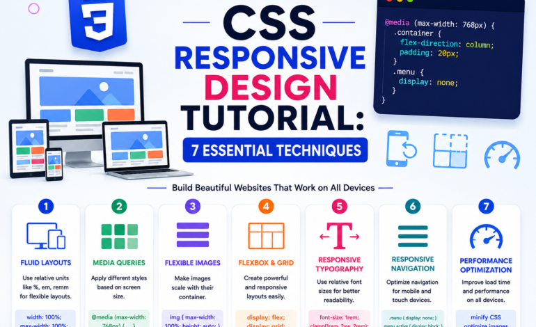
This completes Tutorial 7 of our CSS Grid tutorial series. In Tutorial 8, we’ll cover responsive design and media queries — making your layouts adapt properly across every device size.
This CSS Grid tutorial is part of the complete CSS series on Tutorials Ocean — practical, beginner-friendly web development tutorials. Follow along and build real projects as you learn.